Ten Important UI design principles
StarBox Technologies
Introduction
Web design is fascinating because it combines design concepts, accessibility, functionality, and responsiveness between humans and interfaces, going beyond aesthetics and appeal. In other words, web design is as much about the user as it is about being creative.
Most users will only notice the UI design. As a result, a good UI design is almost imperceptible allowing the user to focus on their work without interruption. And, as varied as design projects can be, all good UI designs tend to follow the same basic golden rules.
But what does “meaningful design” entail? Everything starts with the fundamentals of user interface design. Let’s start with a review of what user interface design is all about. After that, we’ll go over the ten UI design principles to follow for a completely seamless user experience in this article.
What is a User Interface?
The foundation of a website’s look and feel is the user interface design (UI), which ties concepts from interaction design, information architecture, and web design.
It allows users to effectively use software or a website to complete a task or achieve a specific goal, such as purchasing something or downloading an app.
While an exemplary user interface lays the groundwork for a positive user experience, it focuses on the user’s interaction with the interface. On the other hand, user experience design (UX) focuses on users’ overall experience. To know more about their differences, read our article - UI vs UX

User Interface Design (source: starboxtech.com)
10 Important UI design principles
The use of laws, guidelines, biases, and design considerations are all general design principles. User interface design principles, on the other hand, are much more specific, focusing on a single constant interaction between a user and an interface.
Of course, each user interface design project is unique. Particularly in the finer points. And what works for a mobile app might not work for desktop software or a website. Regardless of platform or project, the general principles of good UI design remain the same.
The following are some basic UI design principles that can (and should) be applied to almost every UI design project you work on.

1. Simplicity
The most important of all the major UI design principles is remembering who you’re designing for and why. Good user interface design is functional, not decorative. Self-indulgent or overly formalist design only adds to the clutter, drawing attention away from the truly important elements to the user.
If a user interface feature isn’t helpful to the user, it shouldn’t be there. Prune your design to its simplest form. All unnecessary elements should be removed, leaving only the most essential elements. It shouldn’t be there if a feature of your UI design serves no practical purpose for the user and only serves to satisfy your creative whim.

2. Research
How do you determine what is essential to the user? Making sure you fully understand your user and their needs is one of the first UI design steps to take. You’ll be able to predict what the user will want to do next once you’ve accomplished this.
You can now give the user exactly the tools, information, and resources they require. And at precisely the right time. If this isn’t what you want the user to do, you can predict their behaviour by altering an earlier part of the design so that it leads them in a completely different direction from the start.

3. Control
Users should feel in complete control, whether or not they are. This entails blending the user interface into the background. Of course, it should always be available when the user requires it. It’ll also be exactly where they expect it to be. However, no one should ever believe that the interface is forcing them to do something or making decisions for them. Even if this is, in some cases, precisely what is going on.
4. Consistency
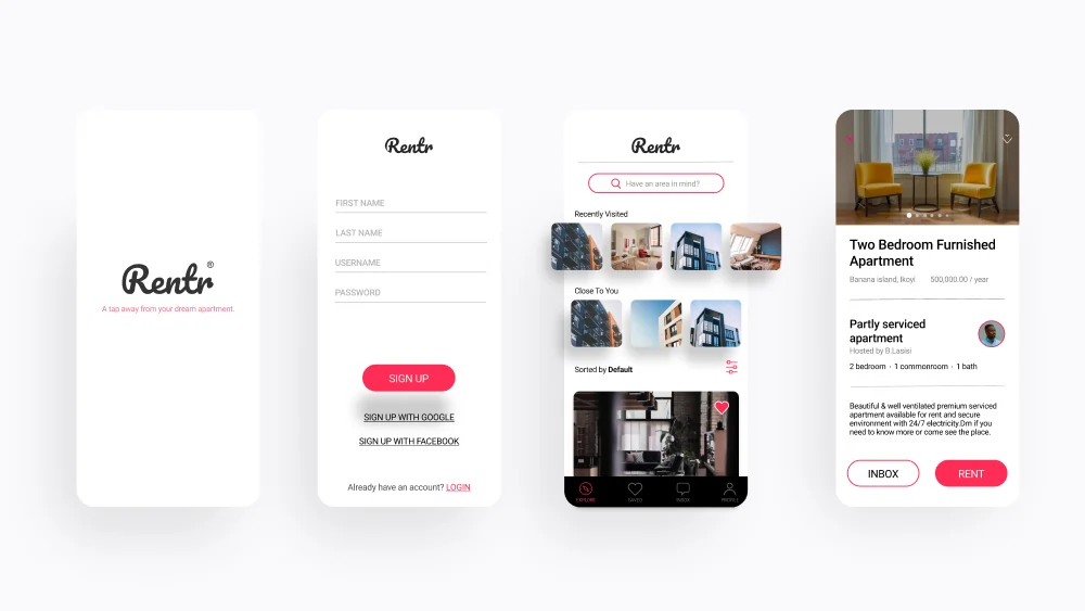
Being consistent is one of the most basic UI design concepts to master. Not just within your platform but also with industry standards used elsewhere. Good user interface design projects don’t reinvent the wheel. Instead, they make it better wherever possible. We support innovation, but “If it ain’t broke, don’t fix it,” they say. Everything from patterns to terminology falls under this rule. If in doubt, go with the most widely accepted option.
However, when new or unusual functions are introduced, it is equally important to distinguish them from previous versions. And perhaps the most effective way to do so is to break one of our own sacred UI design principles: using inconsistency to highlight important and novel features. However, keep in mind that deliberate inconsistency is not the same as sloppy or erratic ones.
Want to get started with a design project?
We’re here to help. Get in touch with us today!
5. Structure
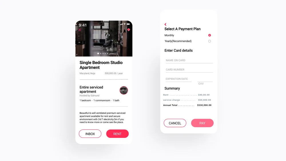
Make sure that information is organised logically, autonomic, and self-contained. One of the golden rules of user interface design is to group tasks and subtasks, both thematically and practically. At all times, aim for the smallest number of steps and screens possible. Condense data and reduce the size of your app by using overlays like bottom sheets and modal windows.
Above all, don’t bury subtasks on pages where no one will notice them. Nobody expects to find a shower in the kitchen, a television in the bathroom, or a closet in the backyard. Create a clear and logical taxonomy for screens and their content.
6. Clarity
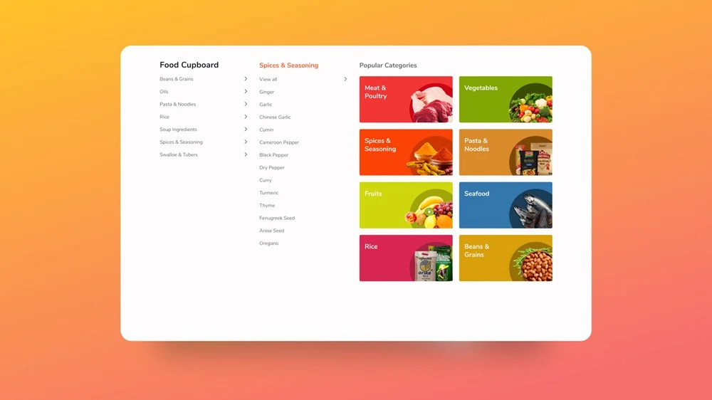
The intuitive layout and clear information labelling are the sixth of our essential UI design principles. Navigating your app should not be intimidating or confusing, even for first-time users. Instead, interface exploration should be enjoyable and almost unconsciously occur.
Make sure the page architecture is straightforward, logical, and well-marked. Users should always know where they are in the software and what they need to do to get where they want to go. Don’t make it difficult for the user to remember how they arrived at their current location. Instead, wherever possible, provide visual navigation cues.

7. Empathy
Mistakes occur. Users can also change their minds. If they’re new to the app, they might not have been sure what they were doing at first.
Don’t hold this against users; make it simple to undo or redo whenever necessary by implementing a quick and forgiving undo/redo feature. This avoids the frustration of lost data and wasted time and gives users the confidence to explore and change their app without fear of negative consequences.
8. Feedback
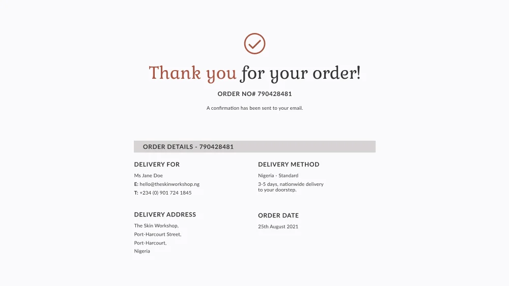
Keep users up to date on their progress. Confirm that the users’ actions were received. Assure them that everything is running smoothly. Big, important, and uncommon actions necessitate big and important feedback. Smaller and more frequent actions, on the other hand, deserve smaller forms of recognition.
Users should always know what’s going on without having to go out of their way to find out or be left wondering if the app has stopped working and why.

9. Hierarchy
One of the most common roadblocks to designing a truly minimal and streamlined UI is the failure to establish a clear hierarchy.
Every element on a screen should contribute to the user’s overall experience. However, among these essential items, some will always be more important than others. Perhaps you already know that most of your users will want to do A? Maybe you should also encourage them to do B? Make these two functions stand out more than C. Changing the size of buttons, text, or other elements could be as simple.
10. Accessibility
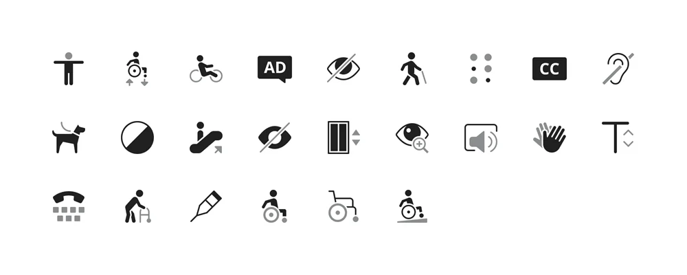
People from a wide range of cultural backgrounds use websites and apps. While it’s understandable that you can’t account for every possible variation in social and cultural convention, don’t assume that the way you do things is the only logical way to do them.
For instance, people read from left to right in many parts of the world, but placing objects from left to right will not necessarily result in all users encountering them from left to right—design with questions rather than answers in mind.
Want to get started with a design project?
We’re here to help. Get in touch with us today!
Summary
The best designers understand that simple UI design principles like the ones we’ve discussed above can help to create a more compelling user interface by facilitating interaction to the point where the user doesn’t even notice the UI. Apply these ten UI design fundamentals to your next project and see how effective UI design can be. To summarise, here is the list.
- Clarity
- Consistency
- Accessibility
- Feedback
- Research
- Structure
- Hierarchy
- Simplicity
- Control
- Empathy
Closing
The goal of good user interface design is to eliminate as many obstacles, bottlenecks, stumbling blocks, and potential sources of confusion from the user experience as possible. Above all, the goal is to create an environment that is fluid and intuitive to navigate for all users, allowing them to accomplish their goals with minimal effort.
Want to get started with a UI/UX design project? Why not reach out to us so we can better understand your business needs. Start your project today.
Let’s keep in touch!
You can unsubscribe at any time.